When Birla Opus asked us to brand their workspace, we knew it wasn’t going to be just another logo-on-a-wall job; so of course, we said yes.
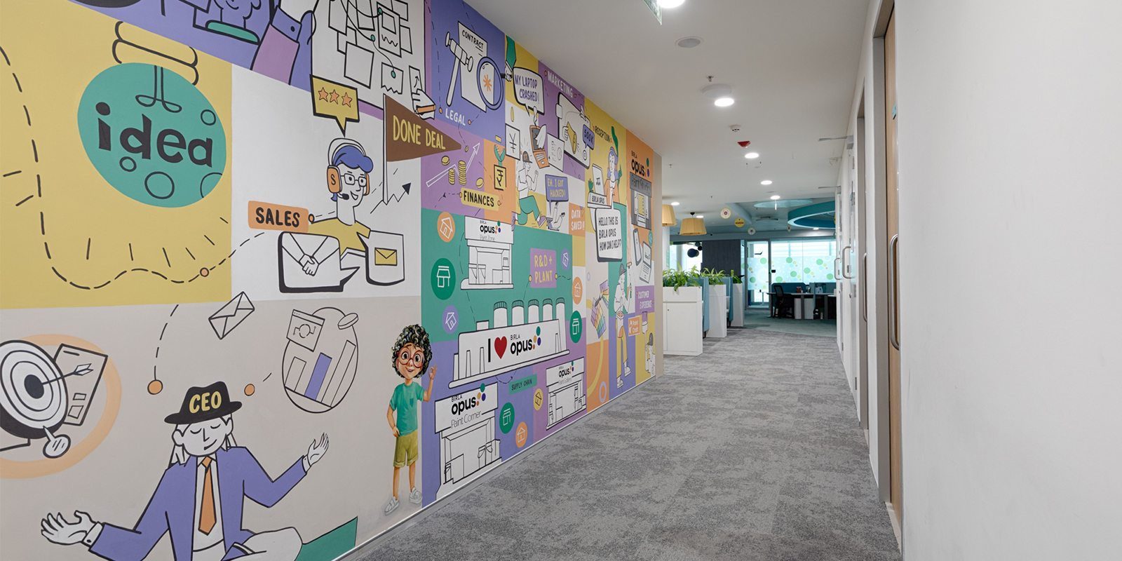
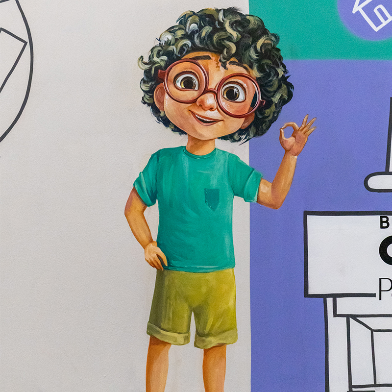
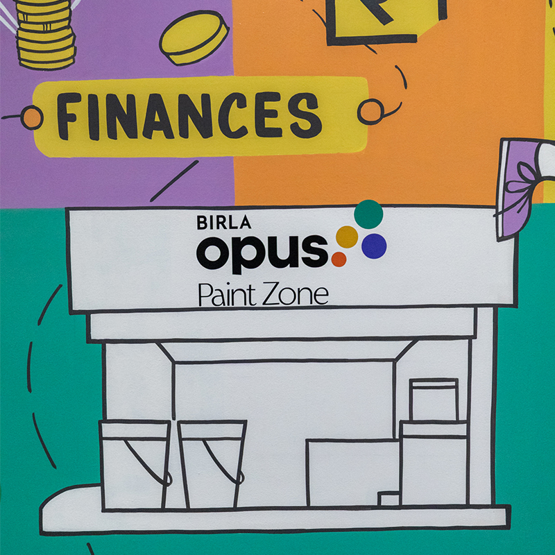
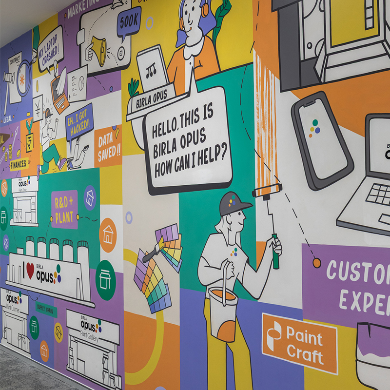
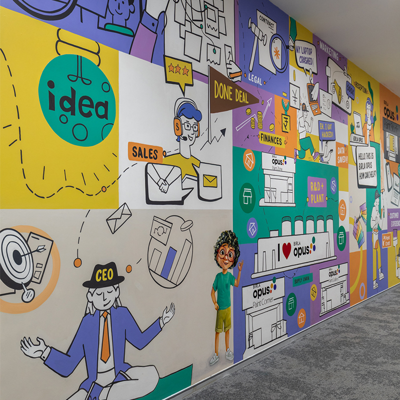
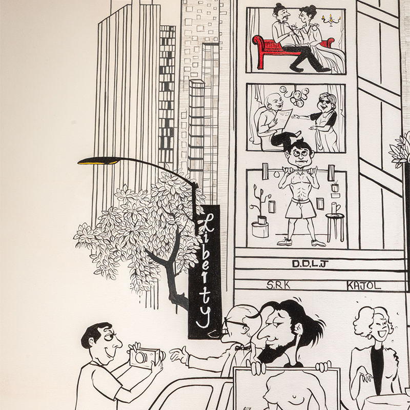
We first started with the doodle wall. This one’s a personal favorite. It brings together every single department that makes Birla Opus what it is; from top management and HR to finance, marketing, IT, reception and more. But it’s not just about who’s represented, it’s about how they collaborate. We’ve illustrated them all in a playful, animated style, and if you look closely, there’s this one connecting line that runs through- it symbolises the harmony between these different teams. How they function as one unit. The background is colour-blocked to add individuality and character, because even within one team, each person brings something unique to the table.
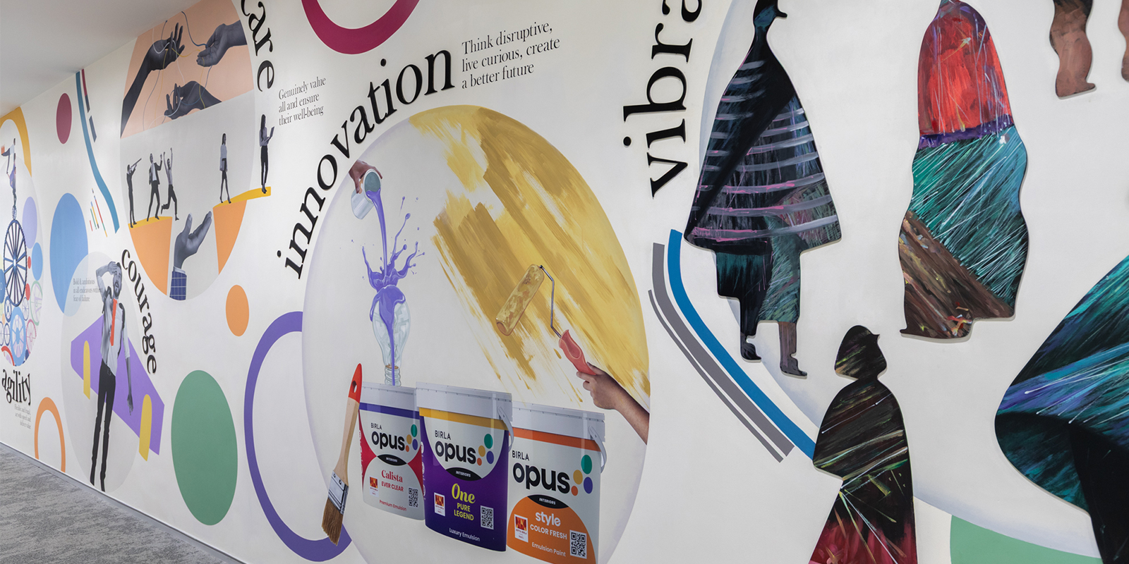
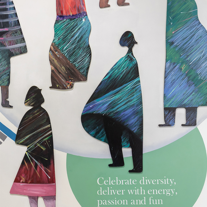
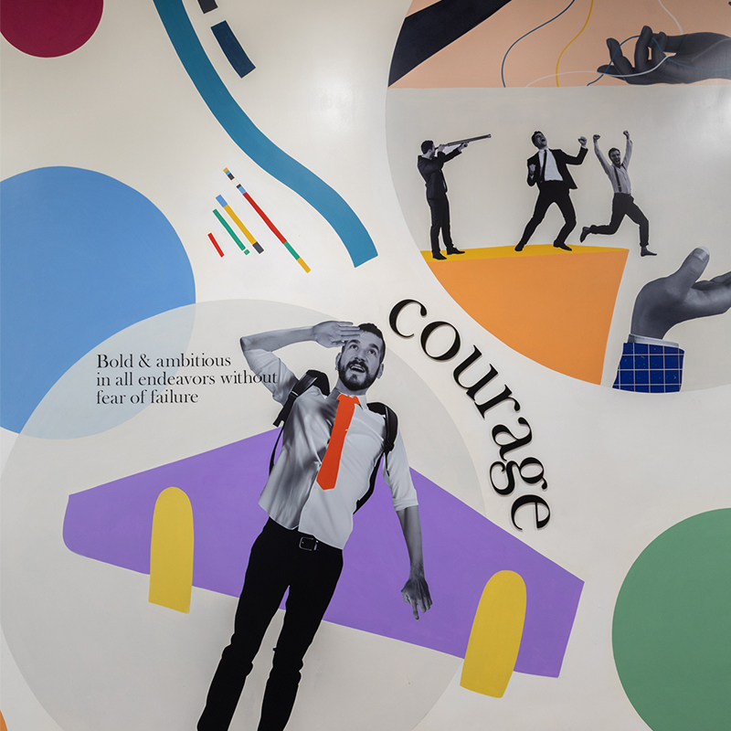
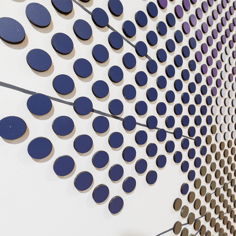
Then comes the culture wall. We wanted to move away from the expected and go for something that feels different. So instead of a standard painted mural, we took it 3D. The wall visually interprets the brand’s core values and those circles? That’s a signature Birla Opus branding element. You’ll see them repeated across their identity. So we used them as a motif here, playful, impactful and deeply intentional.
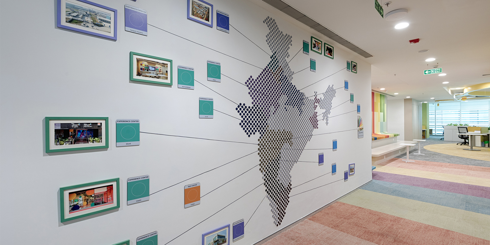
And finally- how could we not talk about the location map wall? A regular map wouldn’t do justice. So we gave it a custom 3D twist, designed entirely to reflect the Birla Opus personality. It marks out all their office locations across the country but in a way that ties it right back into their brand language. Bold, dimensional, and truly exclusive.
Together, these three murals do more than just beautify their workspace- they tell the story of the brand and the people behind it!

